Overview
AsterUI provides 102 components built on DaisyUI and Tailwind CSS.
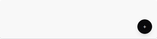
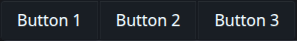
Actions (4)


Data Display (26)
Avatar
Display user profile images or initials.
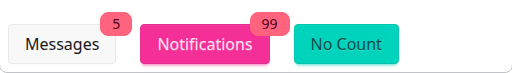
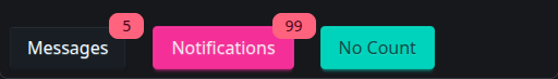
Badge
Small status indicators and counters.
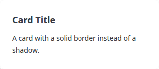
Card
Container for related content and actions.

Carousel
Cycle through images or content.


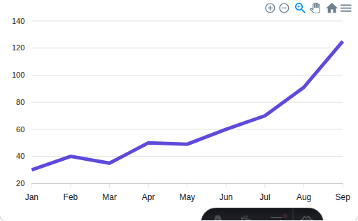
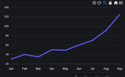
Chart
Data visualization with ApexCharts.
Chat
Chat bubbles for messaging interfaces.


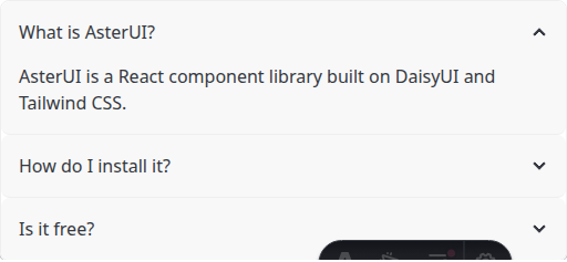
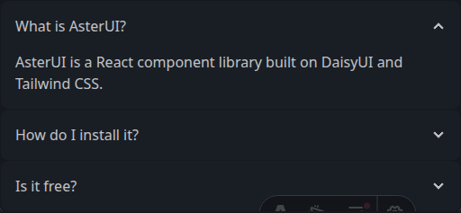
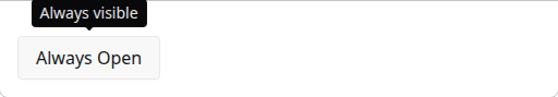
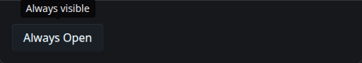
Collapse
Expandable content panels.
Countdown
Animated countdown timer.


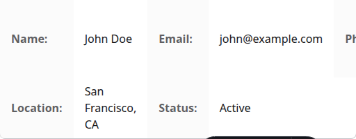
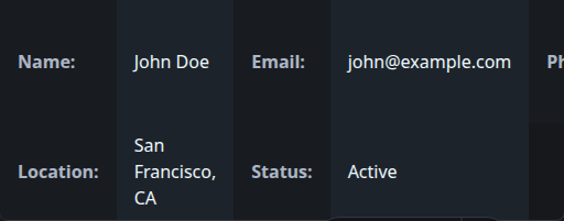
Descriptions
Display key-value pairs in a list.
Diff
Show differences between two items.

Empty
Placeholder for empty states.


HoverGallery
Image gallery with hover effects.


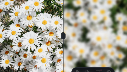
Image
Enhanced image with preview and fallback.


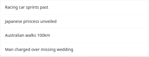
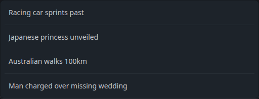
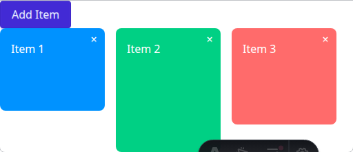
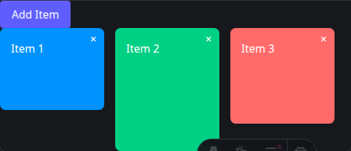
List
Display collections of items.
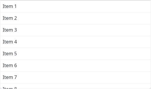
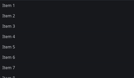
VirtualList
Efficiently render large lists.
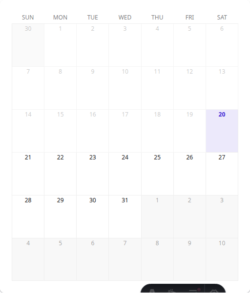
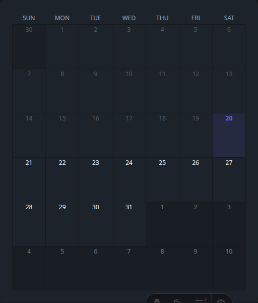
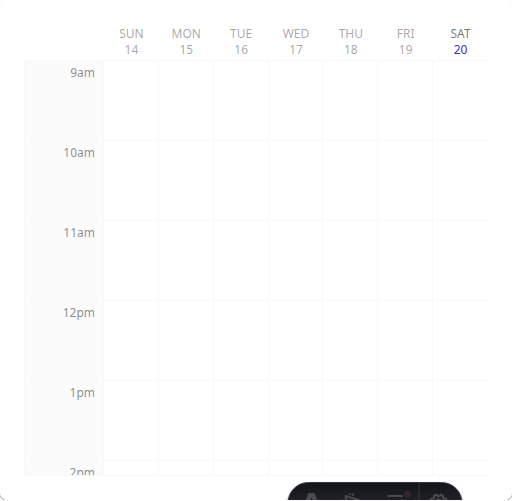
MonthCalendar
Monthly calendar view.
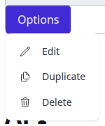
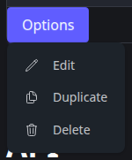
Popover
Floating content on hover or click.
QRCode
Generate scannable QR codes.


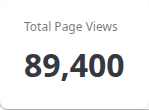
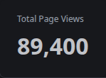
Stat
Display statistics and metrics.
Status
Show online/offline or custom status.


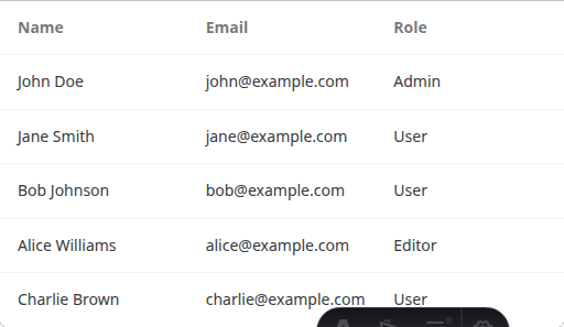
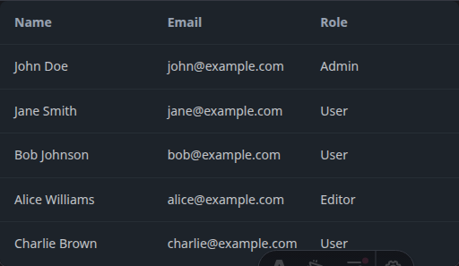
Table
Display tabular data with sorting and selection.
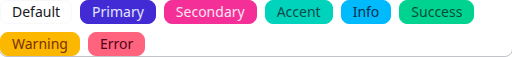
Tag
Categorize content with labels.

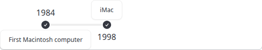
Timeline
Display events in chronological order.

Tooltip
Show additional info on hover.
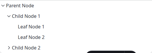
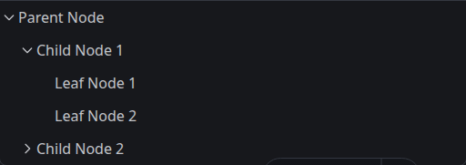
Tree
Hierarchical data display.
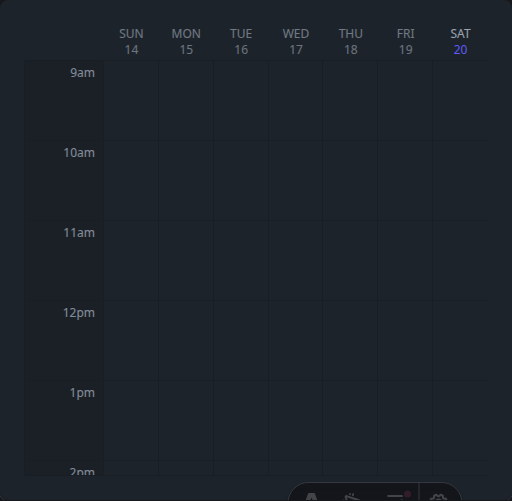
WeekCalendar
Weekly calendar view.
Data Entry (25)
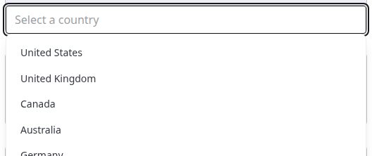
Autocomplete
Input with suggestion dropdown.

Cascader
Multi-level selection dropdown.


Checkbox
Multiple selection control.


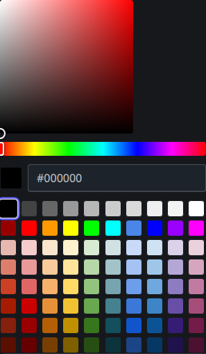
ColorPicker
Select colors visually.

DatePicker
Select dates from a calendar.


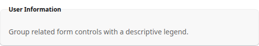
Fieldset
Group related form fields.

FileInput
File selection input.


Filter
Filter data with multiple criteria.
Form
Form handling with validation.
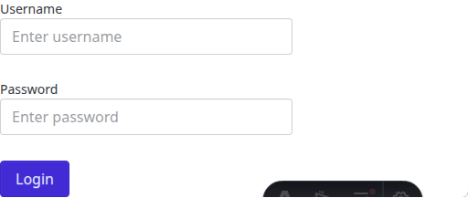
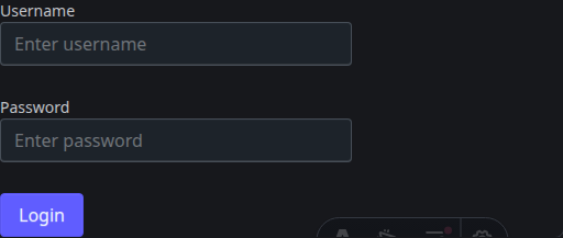
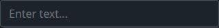
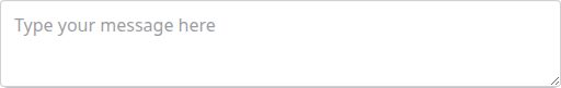
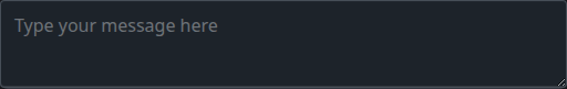
Input
Text input field.

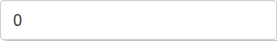
InputNumber
Numeric input with controls.
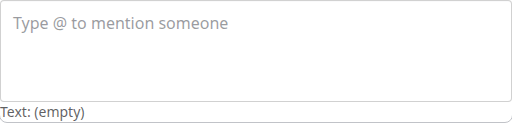
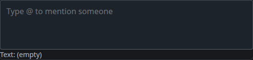
Mention
Input with @mention support.
OTPInput
One-time password input.


Radio
Single selection from options.


Range
Select value from a range.


Rating
Star-based rating input.


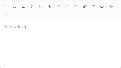
RichTextEditor
WYSIWYG text editor.

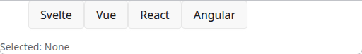
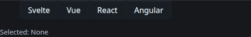
Segmented
Segmented control for switching.
Select
Dropdown selection.


Textarea
Multi-line text input.
TimePicker
Select time values.


Toggle
On/off switch control.


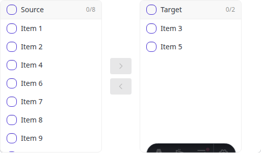
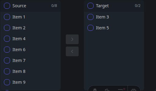
Transfer
Move items between lists.
TreeSelect
Select from hierarchical options.


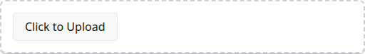
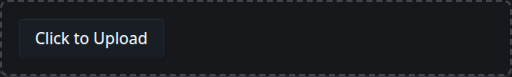
Upload
File upload with drag and drop.
Feedback (11)
Alert
Display important messages.


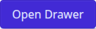
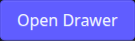
Drawer
Slide-out panel from edge.
Loading
Loading indicators and spinners.


Message
Brief feedback messages.


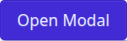
Modal
Dialog overlays for focus.

Notification
Toast notifications.


Popconfirm
Confirmation before action.


Progress
Show completion progress.


RadialProgress
Circular progress indicator.


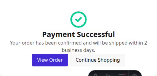
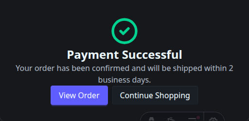
Result
Display operation outcomes.
Skeleton
Loading placeholder shapes.


Navigation (11)
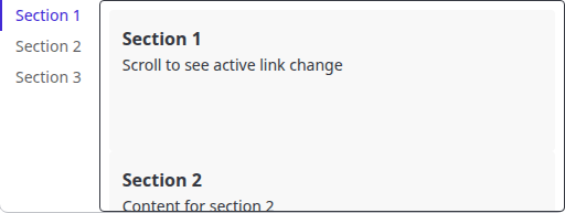
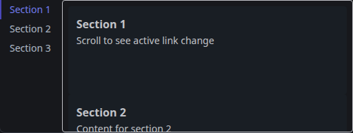
Anchor
Navigate to page sections.
Breadcrumb
Show navigation hierarchy.


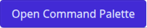
Command
Command palette for quick actions.

ContextMenu
Right-click menu.


Dock
macOS-style dock navigation.


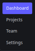
Menu
Vertical navigation menu.

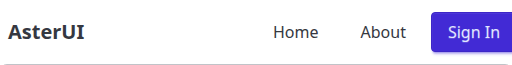
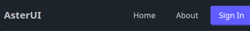
Navbar
Top navigation bar.
Pagination
Navigate through pages.


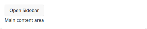
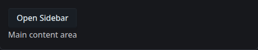
ResponsiveDrawer
Responsive sidebar navigation.
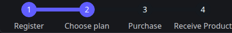
Steps
Step-by-step progress indicator.

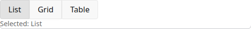
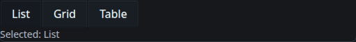
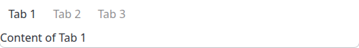
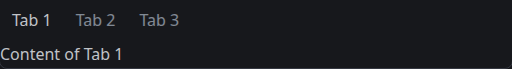
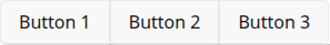
Tabs
Tabbed content navigation.
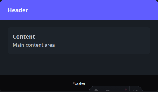
Layout (12)
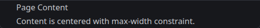
Container
Centered content wrapper.

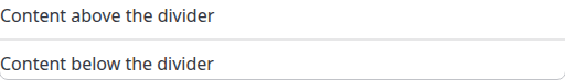
Divider
Separate content sections.

Flex
Flexbox layout helper.


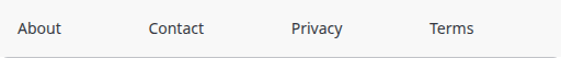
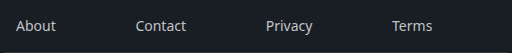
Footer
Page footer component.
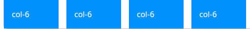
Grid
Responsive grid layout.
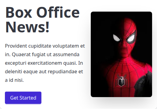
Hero
Hero section for landing pages.

Join
Group elements together.
Layout
Page layout structure.

Masonry
Pinterest-style grid layout.
Responsive
Show/hide by breakpoint.


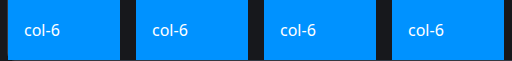
Space
Add consistent spacing.


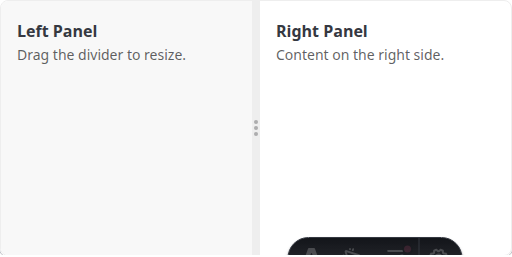
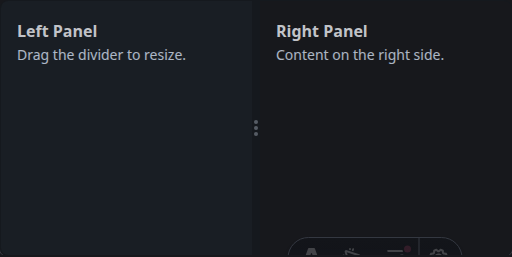
Splitter
Resizable split panels.
Other (13)
Affix
Stick element to viewport.


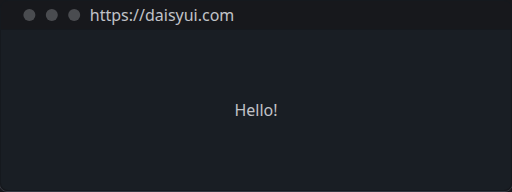
Browser
Browser window mockup.

Code
Display code snippets.
Kbd
Keyboard key display.


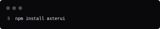
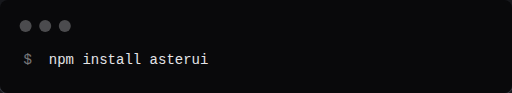
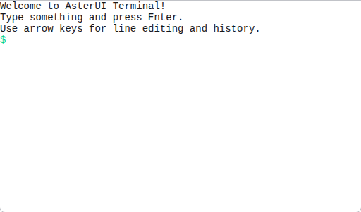
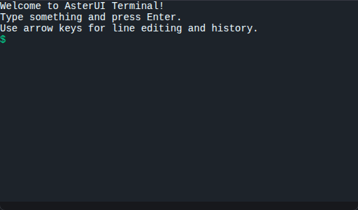
Terminal
Theme-aware terminal emulator.
Mask
Apply image masks.


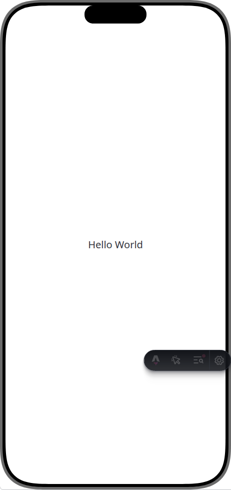
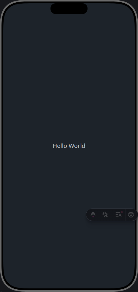
Phone
Phone device mockup.
TextRotate
Animated rotating text.


ThemeController
Theme switching control.


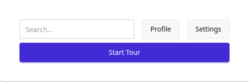
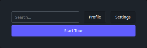
Tour
Guided product tours.
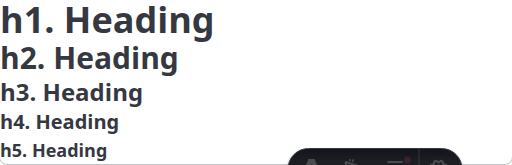
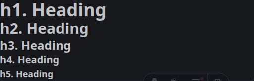
Typography
Text styling components.
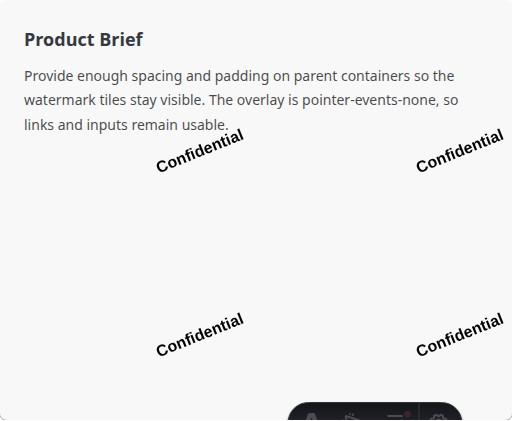
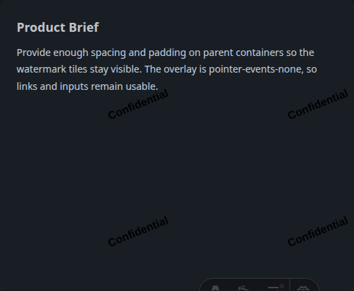
Watermark
Add watermarks to content.
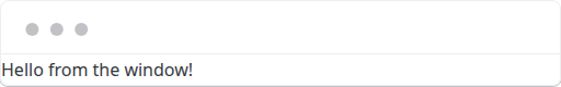
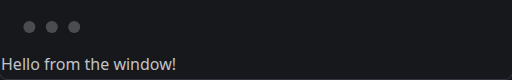
Window
Window frame mockup.